
Case Study
Deliverables
Design System, Unified Listing Experience
CLIENT
Linsey & Leake - Sotherby's Intl. Realty
ROLE
UX/Product Designer
A luxury real estate platform serving the Park City market — built from the ground up with a new design system and a unified search experience that brings map and listings together for the first time.
Design System
Before any feature work could begin, the product needed a design language — one that could hold up against the Sotheby's brand standard while feeling contemporary enough for a design-literate luxury buyer.
DESIGN CONSTRAINT
A luxury real estate platform serving the Park City market — built from the ground up with a new design system and a unified search experience that brings map and listings together for the first time.

Typography
Two typefaces, two roles. PP Neue Montreal carries the brand voice — editorial, geometric, contemporary. Inter handles the utility.

Color
Rooted in the Park City landscape. Brand green pulls from the evergreen mountain environment without being literal. Neutrals are warm, never clinical.
Brand Primary
color/brand/primary
#2A7A2A
Text Primary
color/text/primary
#1A1A1A
Surface Card
color/surface/card
#F4F4F2
Background
color/bg/primary
#FAF9F7
Core Components
Each component built with full variant coverage — every state documented before a single line of code was written.


Developer Handoff
Every token tied back to a named variable. Developers inspect a component in Dev Mode and see token names, not hex values.
Token naming is design work
Naming tokens semantically — color/surface/card not color/light-gray — has downstream consequences throughout the system and took real iteration to get right.
Documenting scroll in Figma
Components with scrollable content need two representations: a full-content unclipped view for documentation, and a clipped viewport view for prototyping. Working out that convention required iteration.
Annotating for AI tools
Beyond traditional handoff, components needed to be readable by AI coding tools (Claude Code-Figma MCP) — which pushed annotation thinking beyond what typical Figma documentation requires.
Moving to chapter 2
Chapter 2: Unified Listings
One Page.
Two Surfaces.
The site's core search experience was split across two disconnected pages. Users who wanted to search and see where properties were had to navigate back and forth, losing filter context every time.


The Core Problem
NAR data shows neighborhood quality is the #1 purchase factor at 59% — yet the UI forced users to choose between seeing location context and seeing listing details. They couldn't have both.
59%
of buyers rank neighborhood quality as their #1 factor — above price, size, or commute. NAR 2024
65%
of users on list-only property sites never found or used the map at all. Baymard Institute
10 wks
median time buyers spend searching online — viewing 7 homes, 2 of which online only. NAR 2024
The Solution
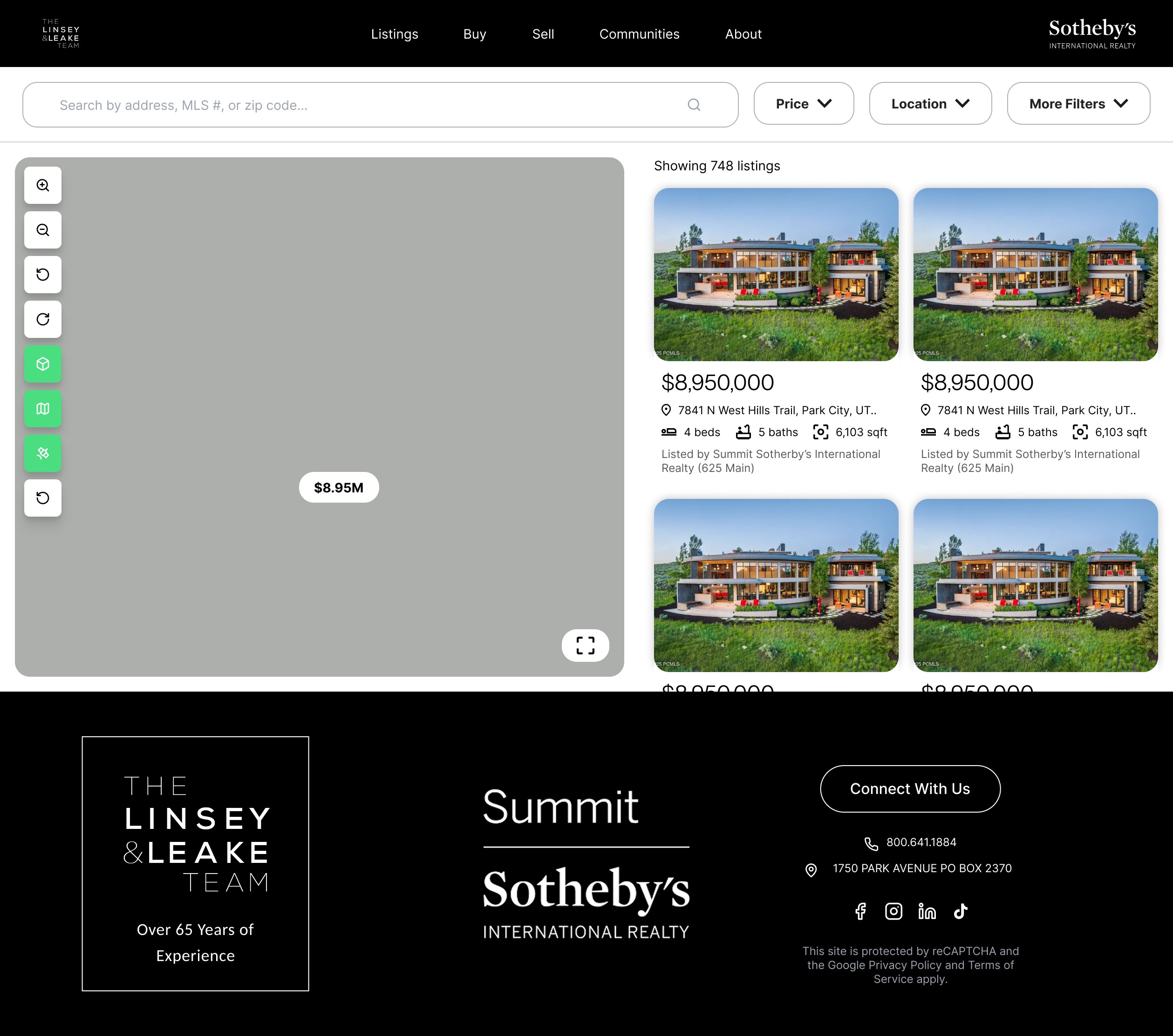
A single synchronized page — 60% map, 40% listing cards — where both surfaces share the same filter state and communicate with each other in real time.
Key Decisions
01
Map-left, cards-right — not the other way around
01
Location is the primary decision driver. The dominant surface should reflect user priorities. Map at 60% left, cards scrolling on the right — not a floating tray, not a minimap, not a toggle.
02
Asymmetric pin ↔ card behavior — intentional, not a bug
01
Clicking a card navigates to the listing page. Clicking a pin activates the card in the list panel and shows an overlay card on the map. The two surfaces communicate but don't mirror — each action does what makes sense for where the user's attention is.
03
Expand map — "Split view" to restore
01
Users can expand the map to full width via a bottom-right icon. The URL updates to ?view=map making the state shareable and bookmarkable. "Expand map" → "Split view" was chosen because both labels describe what the user gets, not what mechanically happens.
04
Mobile: full-screen map by default, floating toggle pill
01
Split-screen breaks down below 768px. Map full-screen by default — location first. A floating "List" pill at the bottom switches to card view. Filters collapse to a single button opening a slide-up bottom sheet.
Mobile Experience
The map page had no mobile experience at all. The new design treats mobile as a first-class surface with its own interaction model.


Design Process Note
The pin ↔ card linked hover behavior can't be natively wired in Figma — cross-component interaction doesn't exist at the prototype level. The approach: document the states clearly in Figma, annotate the linking logic as written spec ("on card hover, find matching pin by listing ID, apply active state"), and hand the implementation to dev. Knowing the line between what to prototype and what to spec is part of the work.
Outcomes
The map page had no mobile experience at all. The new design treats mobile as a first-class surface with its own interaction model.
What shipped
Complete design system and unified listings experience in Figma — full token documentation, all component states, mobile layouts, annotated developer handoff, and interaction spec for pin↔card behavior.
Research honesty
Initially leaned on Baymard's hotel research as a direct citation. Learned to distinguish adjacent research from domain-specific data — supplemented with NAR real estate buyer data as the primary source.
If I had more time
Would have pushed for user testing on the expand map interaction specifically — to validate whether the icon alone was discoverable without a text label alongside it.
Next
Once implemented, track map engagement rate, time-to-first-listing-click, and whether map-engaged users show higher inquiry intent — the metrics that would validate the split-screen decision quantitatively.